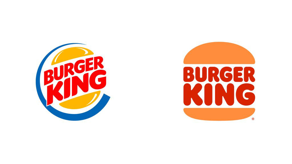
Burger King changed its logo. Let me tell you up front: I like it.
Rooted brands nowadays opt for two ways for rebranding; neutralize the logo with a custom-made sans-serif font, or modernize a well-liked logo from the past. Burger King went for the latter.
They embraced and revised the logo used between 1969-99. Let’s take a quick look what’s gone and what’s came; in the old logo, italic use that refers to the speed, out of date angular + rounded lined mixed typography and blue ring that is not preferred in food communication are gone.
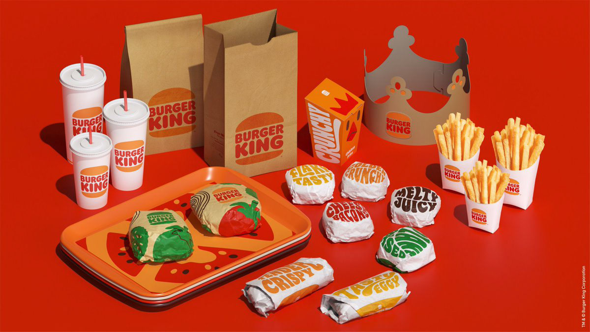
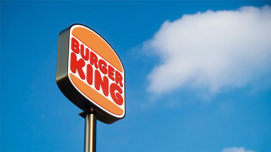
Instead of giving up on the previous typography completely, they took the rounded lines that is use hesitantly in the old logo, and designed a font that feels more appealing and easy to access. The colors are warmer.
I like that the biggest promise, the product is completely at the center now. They gave up on the need to decorate it with flashes and different visual elements that they used in the old logo.
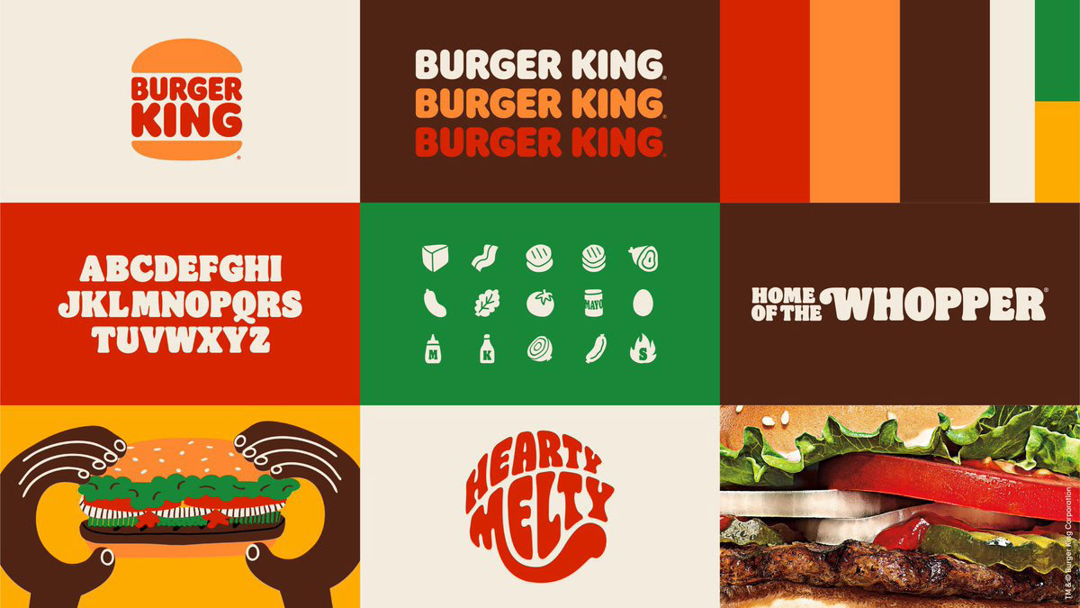
Long story short; the first time I looked at it, I asked myself if it is looking a little out of date; they emphasize that it’s a conscious heritage, it has smooth references to 70’s psychedelic typography world, and they obviously worked for months on the new corporate font ‘Flame’, modern illustrations that covers all of the new identity, and color choices made me believe in this work. Congratulations to the design agency jkr Global who designed this identity.