Cosmopolitan, an American fashion and entertainment magazine for women, first published in New York City in 1886 as a family magazine, later evolved into a literary magazine and, since 1965, has focused on women, becoming one of the best-selling magazines globally. After a four-year hiatus, Cosmopolitan has returned to Turkey, relaunching as a multi-platform brand, aiming to inspire and advocate for young women and underrepresented groups. With the involvement of both the Cosmopolitan Turkey team and the Hearst Media team in New York, the magazine collaborated with us for its new visual identity in Turkey, repositioning to inspire Millennial and Gen Z women across the country.
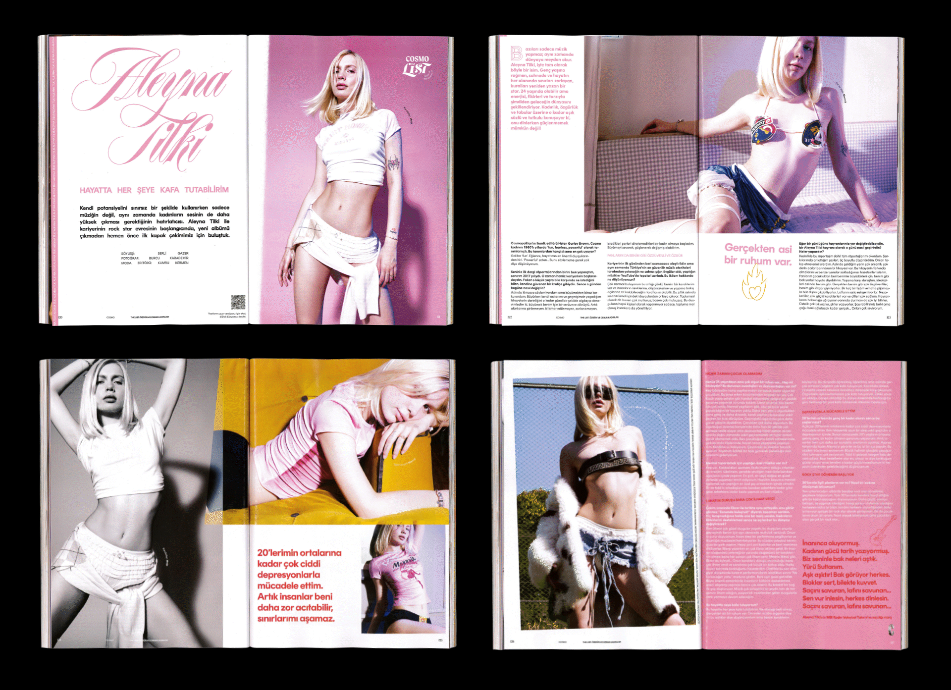
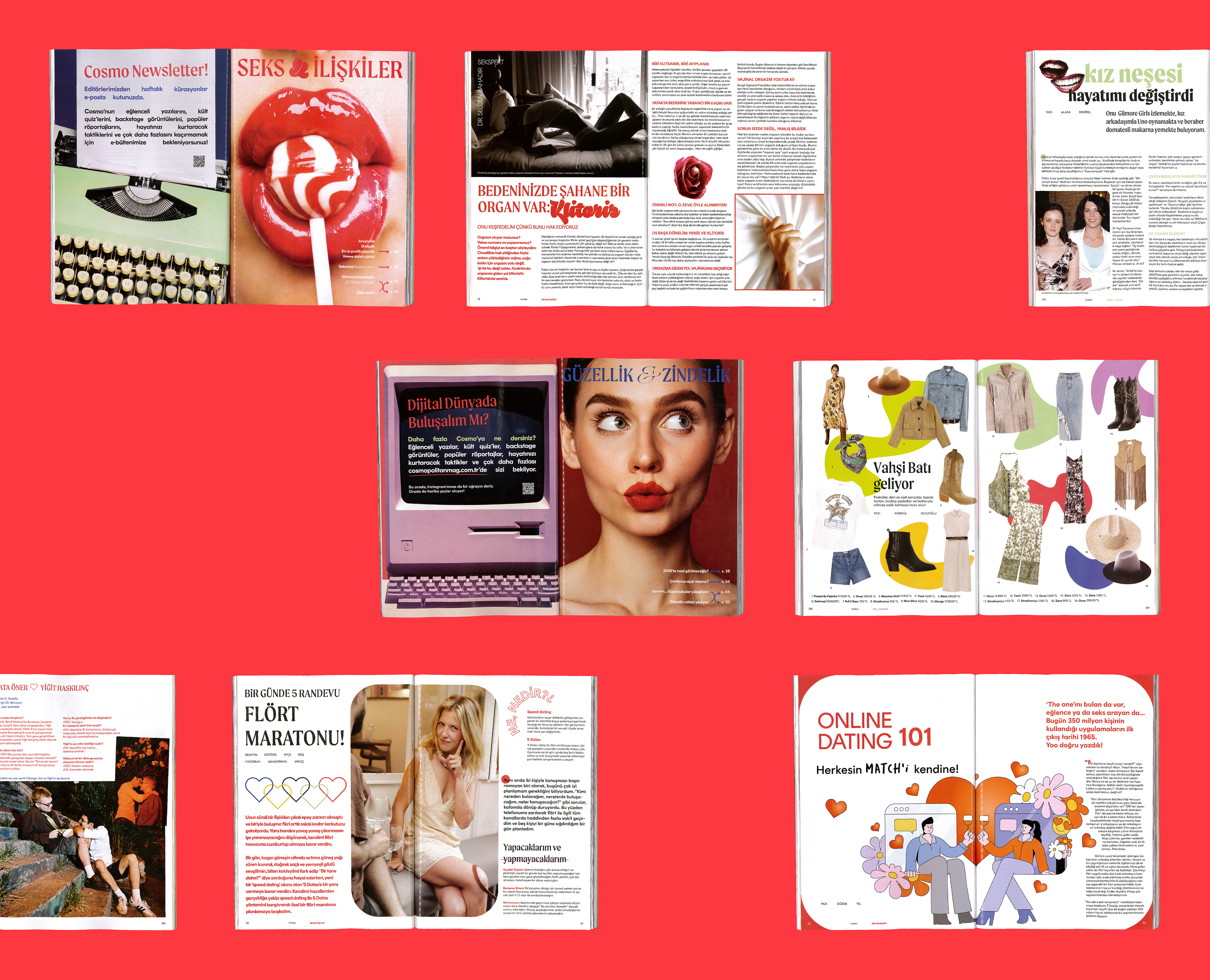
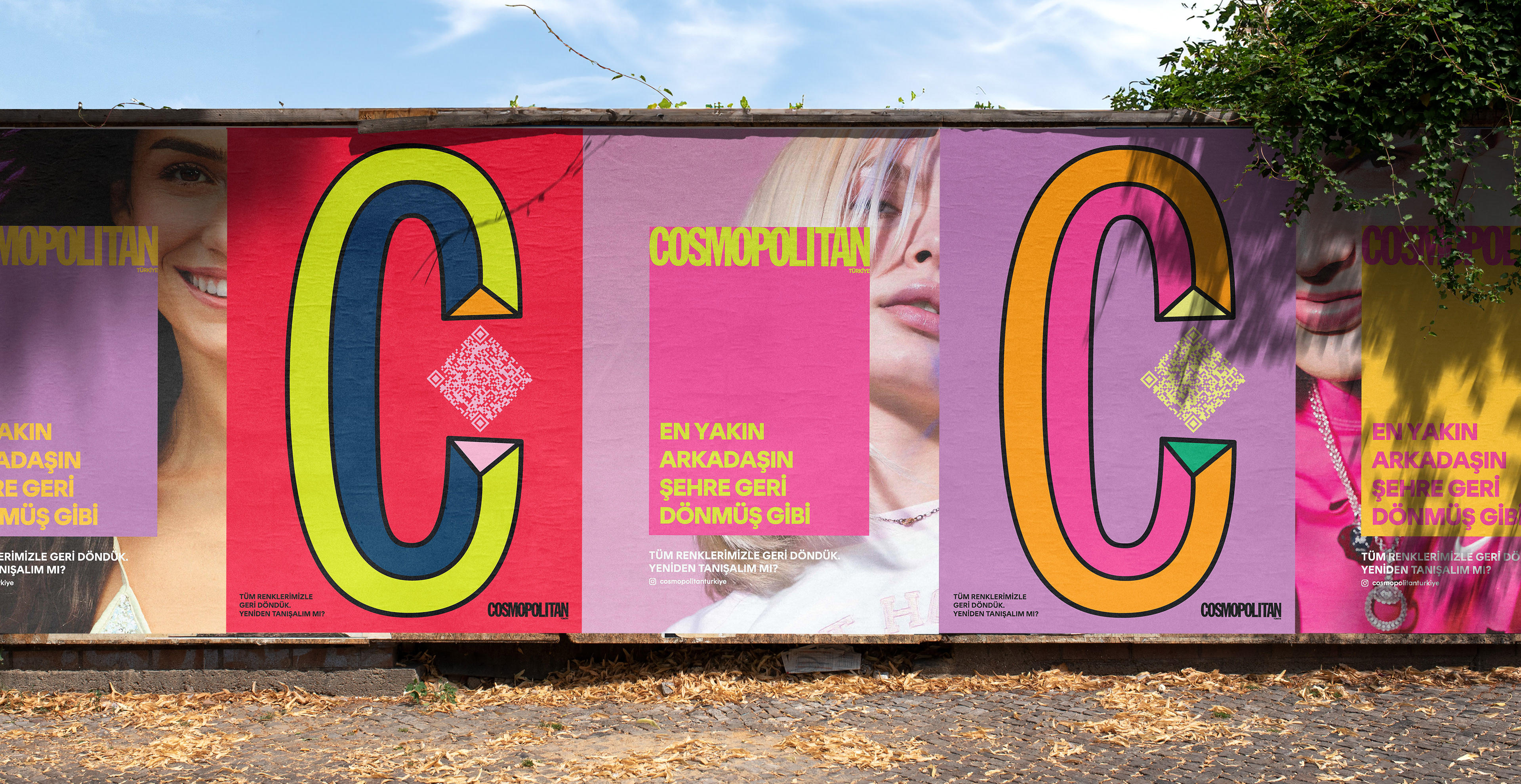
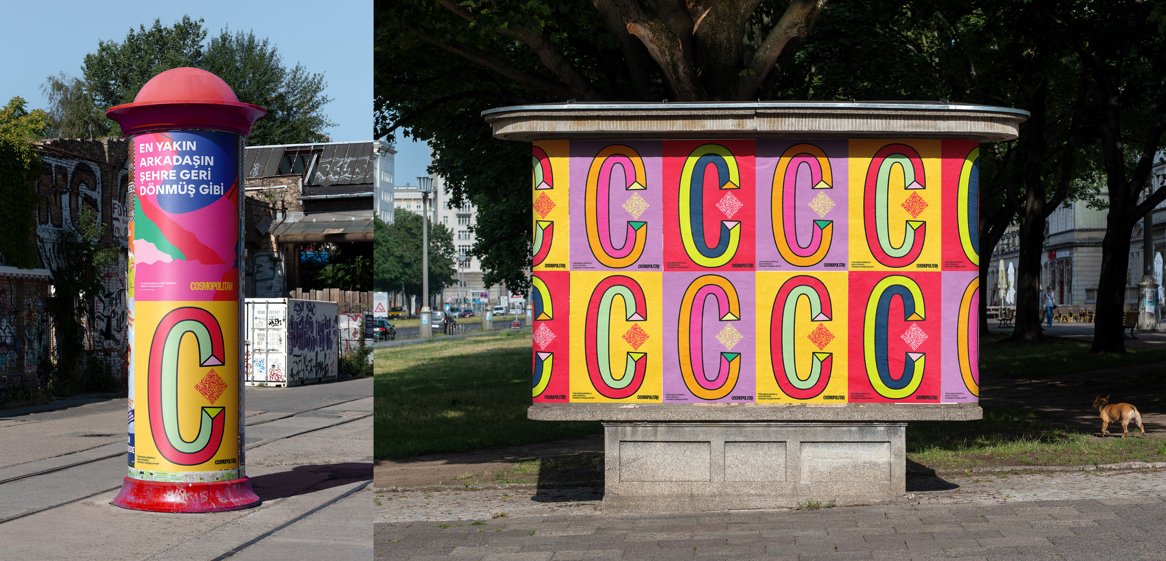
Cosmopolitan follows global guidelines across its editions, with subtle regional adaptations. While the “Cosmopolitan Woman” is known worldwide for being fearless, fun, and confident, in Turkey, she must go further—challenging labels and embracing her imperfections. This mindset guided our design approach to Cosmopolitan Turkey’s new identity, making it more colorful and unapologetic. To connect with these women and mirror their strengths and challenges, we intentionally employed unconventional design elements often seen as flaws, such as “white rivers,” overlays, and distorted typography, while introducing new font families, using them sparingly to stay within global Cosmopolitan guidelines. Brand colors became a core visual asset across all platforms, nearly as important as the cover celebrities. We boldly used neon Pantone colors on covers and vibrant patterns in outdoor campaigns, emphasizing that there’s no shame in embracing and expressing their authentic, colorful selves.