Think about a club whose first logo that was designed in 1908 is much better than its last logo in 2021.
You already know about why the logos are simplified nowadays thanks to my previous reviews, come on! So I’ll just start with my opinions on new logo of Inter Milan. And I will tell you about the history of the logo in the tweets down here.
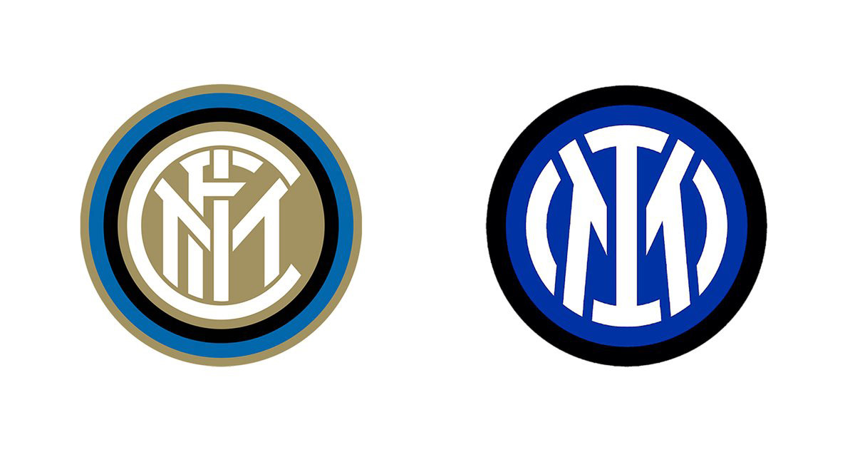
New logo is strong in its patch value, yes, but it lost the feeling. The reason for that is because they exaggerated thick monoline usage and that they gave up on the gold color; but I think it feels vulgar. How to put it, it’s like a MLS team logo, it’s that dull.
Don’t get me wrong, all of the new touches in that logo is technically understandable, they’re all about simplifying it, but in an area like visual communication where creating feelings are so important, only technique is not always enough.
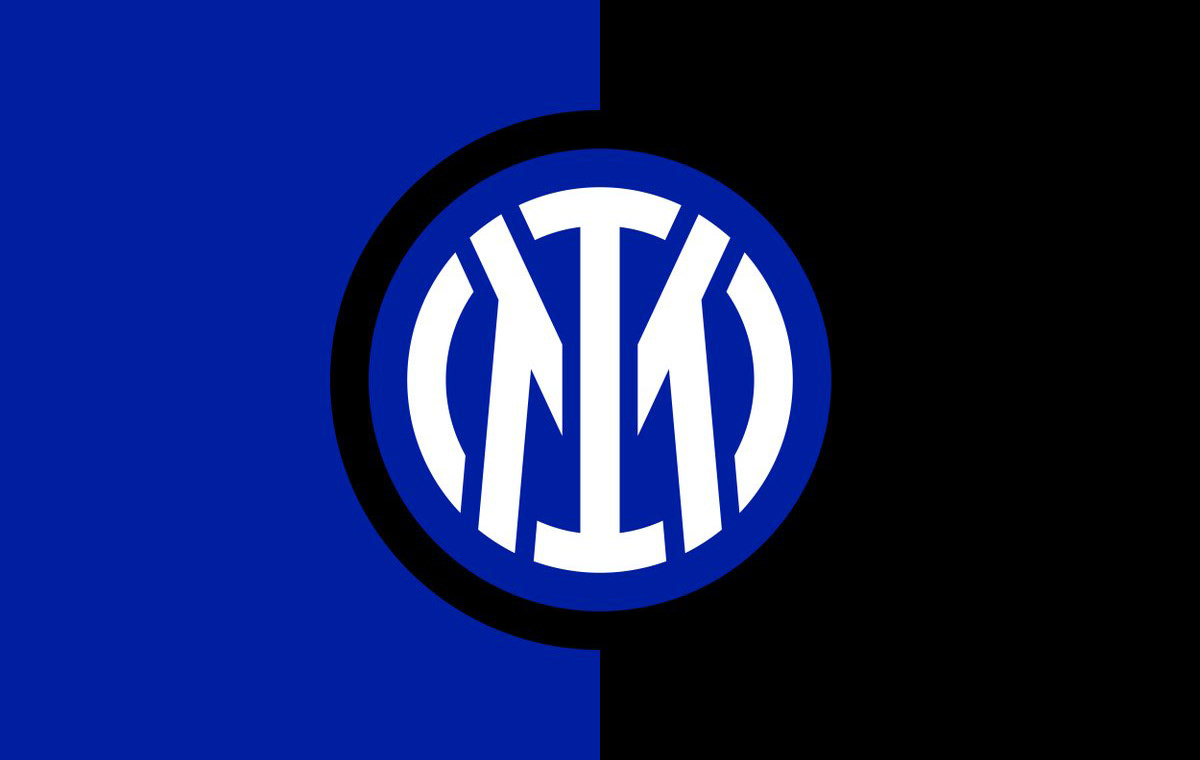
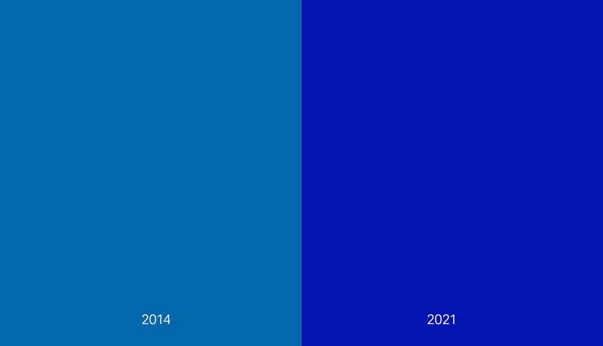
Considering they only used black, white and dark blue, they could only change clue. They choose a more eye catching blue for the digital world. Giving up on gold also gave way to this preference. The harmony between gold and dark blue was stunning.
Between the logos, my personal favorite is the one with star on it. I believe that yellow and star add more feeling to the logo than they intended.
The choice of main font is Giorgio Bold. A secondary font in Univers Roman 55 that is used in the texts. An interesting detail; the designer of the first logo that I am about to tell you about is famous artist ‘Giorgio’ Muggiani, so it’s a funny coincidence that they picked a font named 'Giorgio'.
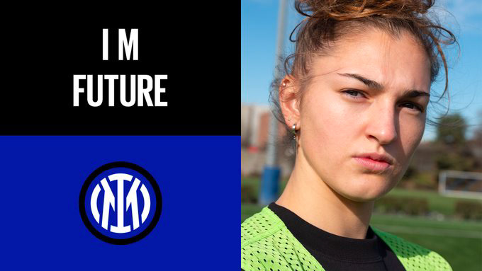
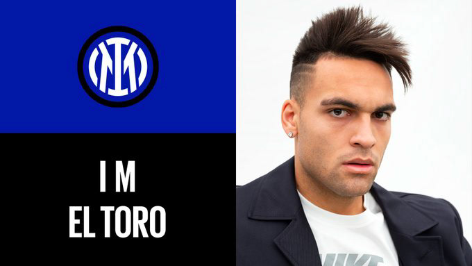
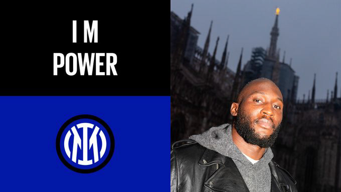
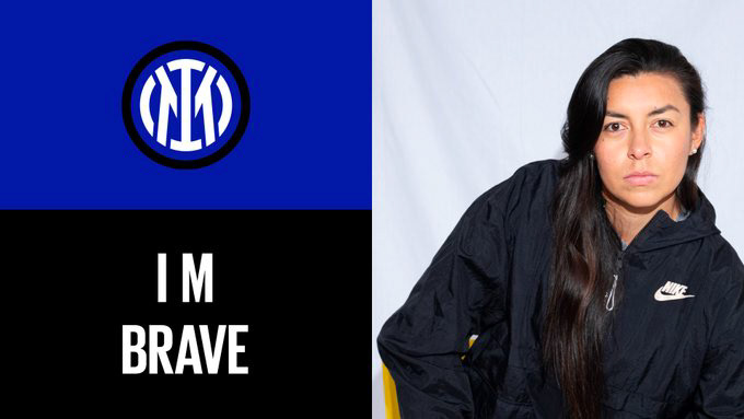
The most important part of the simplification is getting rid of the letters F C and put in I and M in the center. Thanks to the meaning of ‘IM’ in English, it is sold to the customer as a strategy bigger than the logo, it’s an effective campaign idea, but I believe emphasis on ‘’I’m’’ will be temporary.
Hence, the campaign idea is really powerful. It makes you feel possessive of everything you put ‘’I’M’’ before it. If I have to see it as an advertiser, not a designer, I like the strategy a lot. But it doesn’t make me like this logo more. It’s essential to know the difference.
Poster layouts of the campaign could be better. I feel very uncomfortable that photography styles have nothing to do with each other. One is natural, the other with flash, the other has a studio background, the other with endless background etc. It didn’t give me the feeling of variety, but negligence.
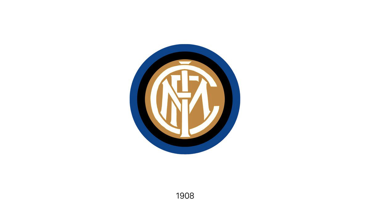
Let's finish by taking a look at the history of the logo. First logo of the club is designed by artist Giorgio Muggiani. He is considered as ‘an artist’ but the reason for this is that there wasn’t a branch called graphic design back then. I think he was a great graphic designer, take a look.
The previous video that club’s official page posted and short history down there the logos are shown too yellow. In all of the other sources, first logos are closer to gold color. I think those yellow versions are changed as they are used in presentations.
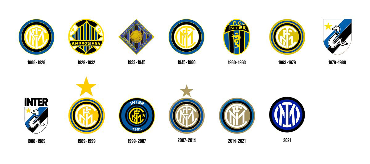
In many other sources, I always run into this logo first. I think this logo is more effective than the last one. Thin strokes in it creates problems today in small scales, that is true, but I’d still prefer a revised version of this logo.
And as you know, selling the logo to the customer as important as designing it. You should DEFINITELY look at the website they prepared for this rebranding, it’s really good. They marketed this logo as best as they could.
Shortly, even though I don’t love this logo, it’s clear that there’s a strong team behind it. The signature under it belongs to design office from Munich, Bureau Borsche. Among their works, there are logos of great companies like Balenciaga and Rimowa. Let’s see if we’ll get used to this logo in the next years.