Isabella LaFreniere
Isabella LaFreniere is one of the principal dancers at New York City Ballet, one of the world's leading ballet companies. She pairs classical discipline with an accessible warmth, and her visual identity had to hold both truths at once: technical precision and human closeness.
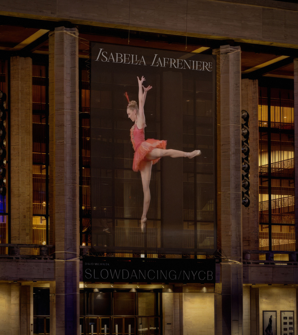
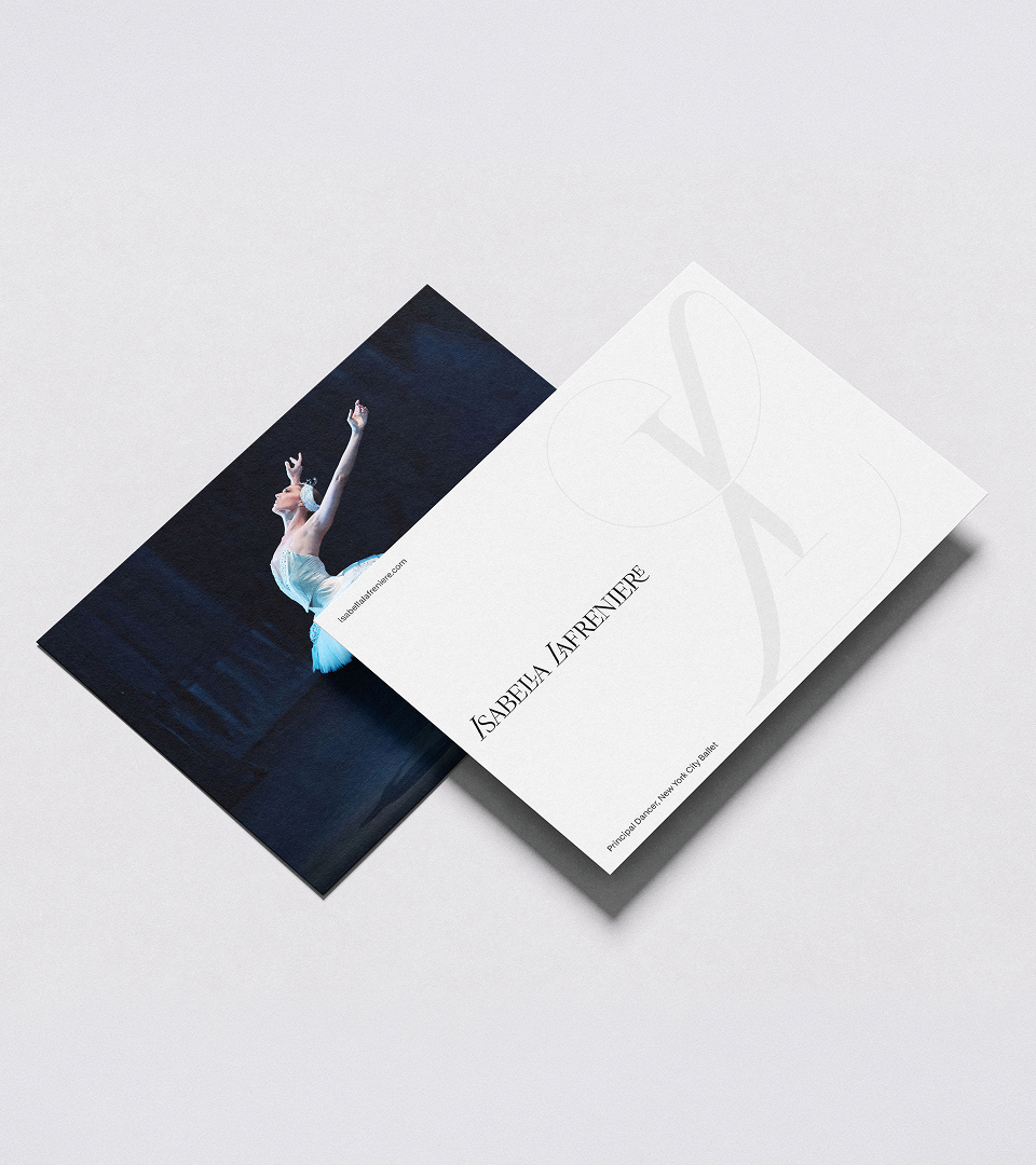
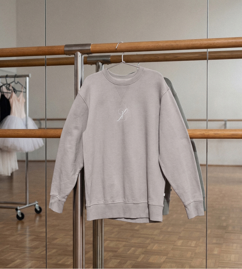
At the center of the system is Bella Display, a bespoke typeface designed specifically for this identity. Letterforms are cut along lines drawn from a ballerina's posture and the balance within it. Custom ligatures read as choreography frozen mid-motion, small connections between letters standing in for the connections between bodies on stage. A fluid-form monogram, built to work alongside the logotype, spans a range of optical styles from high to low contrast and captures the flow of movement unique to ballet.
Logotype and monogram set the tone for a wider graphic system built on the same discipline: an editorial type hierarchy, generous negative space, and a controlled monochrome palette that keeps focus on form and motion rather than ornament. The same logic carries through the website design, presenting Isabella's work with the clarity of a stage rather than the clutter of a typical portfolio.
The result is an identity that treats Isabella not as a distant classical figure but as a working artist: precise where her craft demands it, and just as warm as her presence and personality invite.