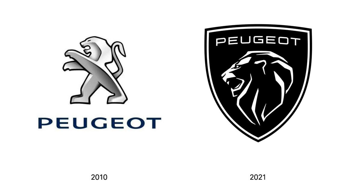
Peugeot made a big change in its logo. We better call it a ‘change’, not an ‘innovation’, because Peugeot, like many other rooted companies, choose to pick a logo from its past, adapted to our day and preferred to emphasis its ‘legacy’. Continue with the lion. Pay attention to the logo in 1960 in the video.
As we know, a rebranding craze is going on in the world nowadays. We said that the main reason for this is digitalization; but especially in the automotive industry, all of the giants like Volkswagen, BMW, Nissan and KIA preferred to go with minimalizing their logos.
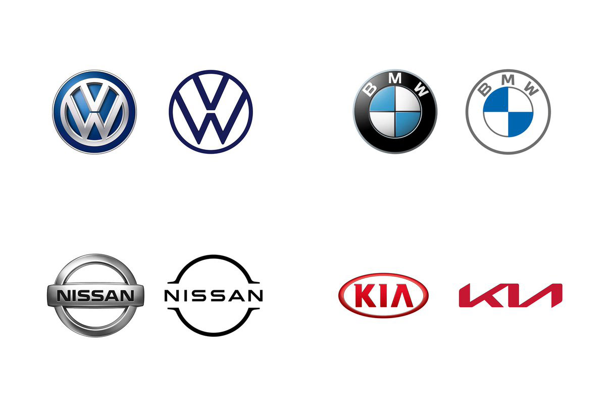
One of the reasons for that is the requirement to opt for logos that will adapt to digital age, but one other reason is the change of perception about the cars in the world. As we know, electric cars will take over the market in the coming years, and also with environment-friendly terms like ‘zero carbon emission’ entering our lives, car companies are trying to change the perception. Instead of the image of selling bulky cars that takes you from one place to another, we can say they are evolving into innovative tech companies.
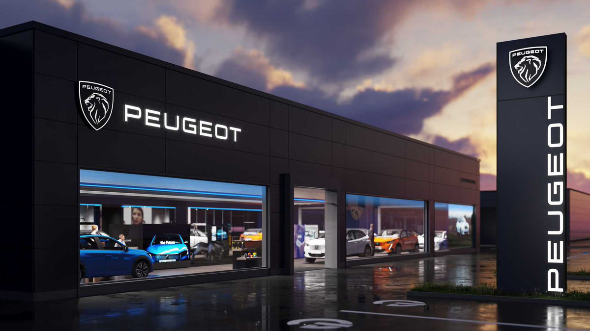
There is another main reason for Peugeot’s logo change. Peugeot wants to sell more expensive and luxurious cars from now on. We can see that preference in the logo change. New branding is well placed in this regard.
Peugeot authorities described this replacement as ‘’crowning of company’s moving to the high-end market’’ in their announcement of the new logo. This work wasn’t done by the huge design companies that we know; but an inner working called ‘Peugeot Design Lab’.
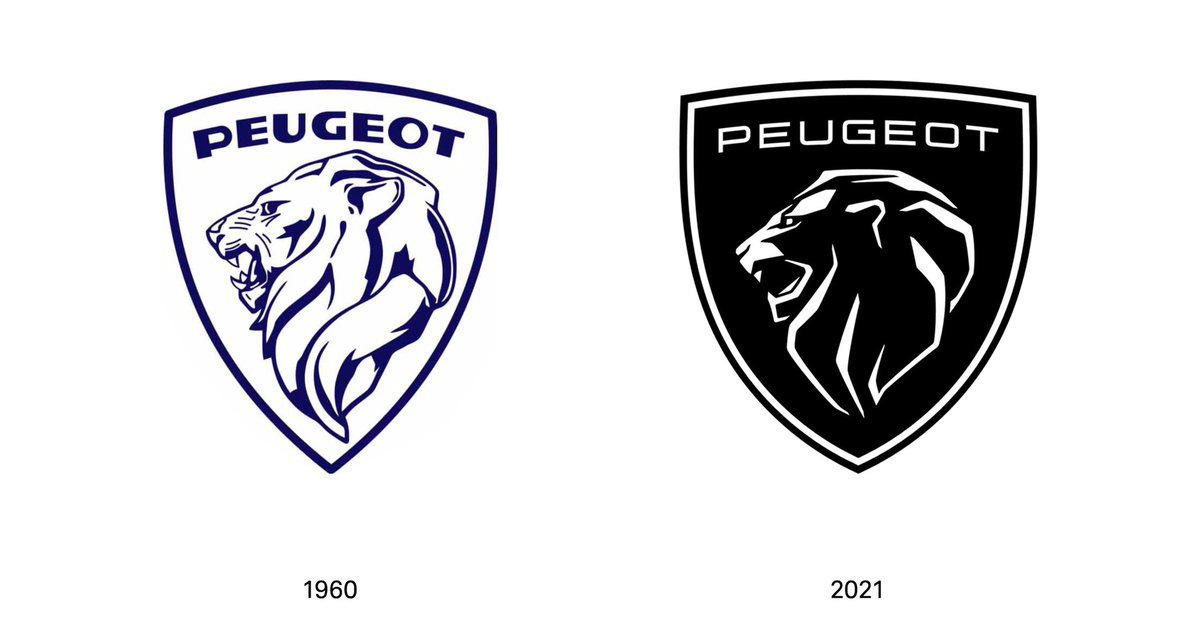
If we compare it to the 1960’s logo, typography is revised (1960 version, the letters aren’t on the ground, they float independently, they changed this), they used a logotype that feels more luxurious, that’s understandable, it’s okay to use the crest on the shield, but there are subtle problems with the logo.
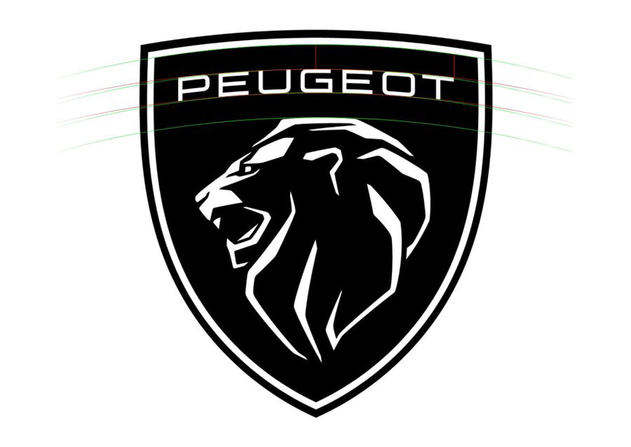
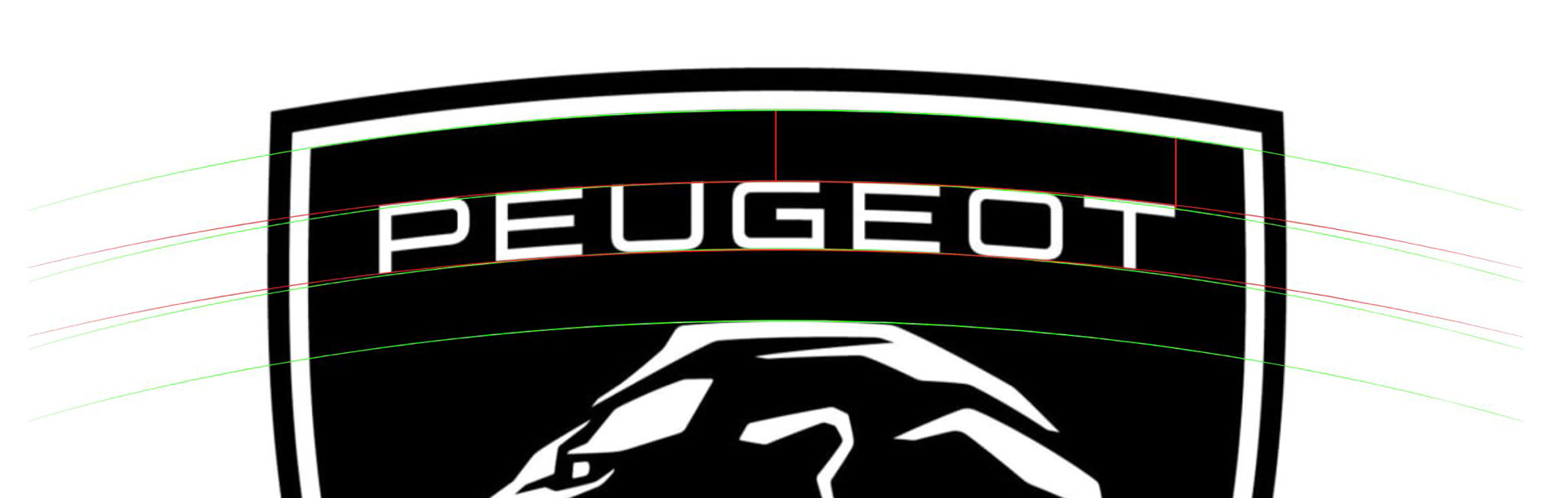
These are the problems that many people won’t see, but they are still there. Firstly, angle of the logotype, angle of the shield and the lines over the lion’s head doesn’t fit together well. I tried to show it in the visuals. This mistake can drive obsessive eyes crazy.
Secondly, there is a small mismatch within logotype, lion and the shield. There is a misbalance between logotype’s letter thickness and the thickness of the line that surrounds the shield; the shield (as a stain) steals a little from the logotype. And the different thickness of the lines within the lion add dynamism to the logo and gives a modern feeling, but it’s completely different than the rest of the visual aesthetic of the logo. It’s difficult to explain, but let me put it this way, 3 main features that I highlighted with different colors didn’t give me the feeling of a complete harmony.
The last one is, the fact that logo loses its effect in smaller scales. Lion form, because of the style of illustration, turns into a meaningless stain when it is smaller. Among the flat rebranding we have seen so far, this must be the least appropriate one to use in small scales.
About the branding world, they designed a new font called ‘Peugeot New’. The logo is far from typography world, but it’s an appropriate font for the corporate care world. The color palette is mostly made of darker tones, blues and greens because of the aimed brand perception.
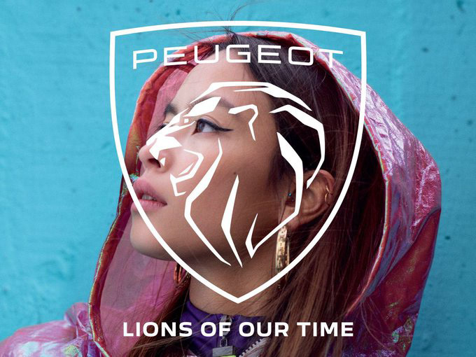
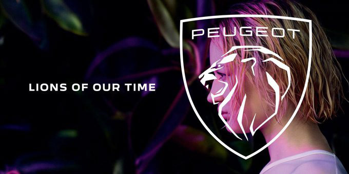
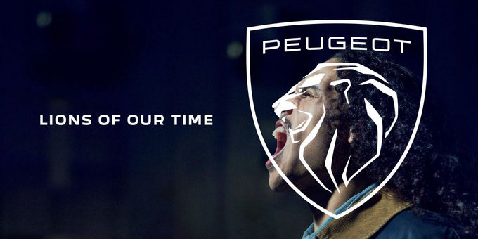
Let’s take a short look at the new campaign. It was the logo change 10 years ago that they pushed for a campaign. Naturally, they needed an image campaign for the new logo and brand replacement. The slogan they went for is ‘lions of our time’.
It makes sense to emphasize ‘time’ because the 1960 logo returns. Instead of bloodless lion in the old logo, it’s a good choice to focus on the emotions and ‘you are a lion’ with a roaring lion. By the way, this campaign idea comes from Being Çözüm that won the global pitch.

Finally, I think Peugeot will spend at least another 10 years with a logo that has strong and weak sides. The general change around the logo will probably deliver the brand to the target market, so beyond good/bad, we may call it successful.