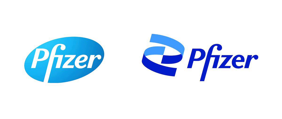
Pfizer, one of the biggest drug companies of the world, renewed its logo. After 18 months of work, the oval shape that was in the use for 70 years is replaced with two spirals. Corporate identity is done by Team design. And the one designed the logo is Turkish; Sabri Akın.
Giving up on limiting themselves in a closed form that resembles a drug, they opted for to visualize it with two spirals that touch each other and include negative space. Pfizer identified this change as ‘from trade to science’.
These two spirals clearly symbolize DNA, but also with Akin’s own words: ‘’It emphasizes the contribution of the brand to the continuity, reformation and science".
Typography is kept with its main lines; rounded ‘z’ and ‘e’ letters in the previous logo became more angular. The reason for that must be that the old oval form doesn’t bind the typography anymore. This small touch, integrates the emblem and typography.
In the color choice, instead of using degrade that has lost its validity in the world, they used intransitive two blue shades; we can even say they are a little late for this revision. Pale blue color choice from 1950’s takes a backseat.
For the primary colors, Pfizer explains adding a blue that is stronger, more appropriate for the digital color palette with ‘’in an industry full of blue colors, we are doubling it up’’. With the rest of the branding, these two shades of blue is accompanied with a wider blue palette.
As you know, a lot of rooted brands who are renewing the corporate identity chooses to create their own font family, yet Pfizer didn’t need this and they opted for a font family that is developed by Google, Noto Sans as their corporate font.
The reason for it could be that it’s an appropriate, easy to read, clean font for a company based on science. And because the font has Google background, it’s naturally compatible with digital, and it already supports many languages; this can be added to the reasons.
In the visuals world, it has 75 degrees angle in the logo, which creates an organic bond with the logo, and it adds a dynamism that the brand didn’t have before.

Finally, it’s clear that the launching date of the new logo is a result of a strategic planning. Since the entire world is waiting for COVID-19 vaccination and Pfizer is in one of the leading roles; they couldn’t pick a better time for the launch.