Puk & Partners
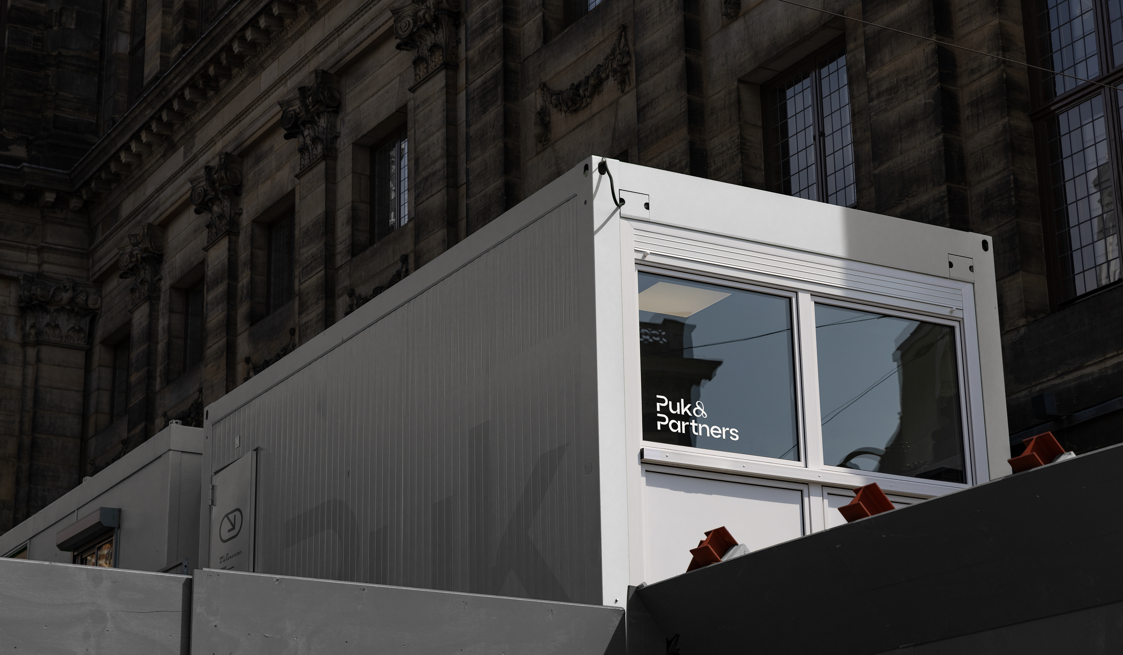
Puk & Partners is an architecture firm that translates brand standards into physical spaces. With an operation network spanning 43 cities across Türkiye, a portfolio of more than 300 projects and partnerships with more than 50 brands. It delivers showrooms and stores for national and global names such as Mercedes-Benz, Lululemon, and Samsung, taking each project from the first design decision to final delivery. For the rebranding, we connected the firm’s name with its way of working and placed this approach at the center of the identity.
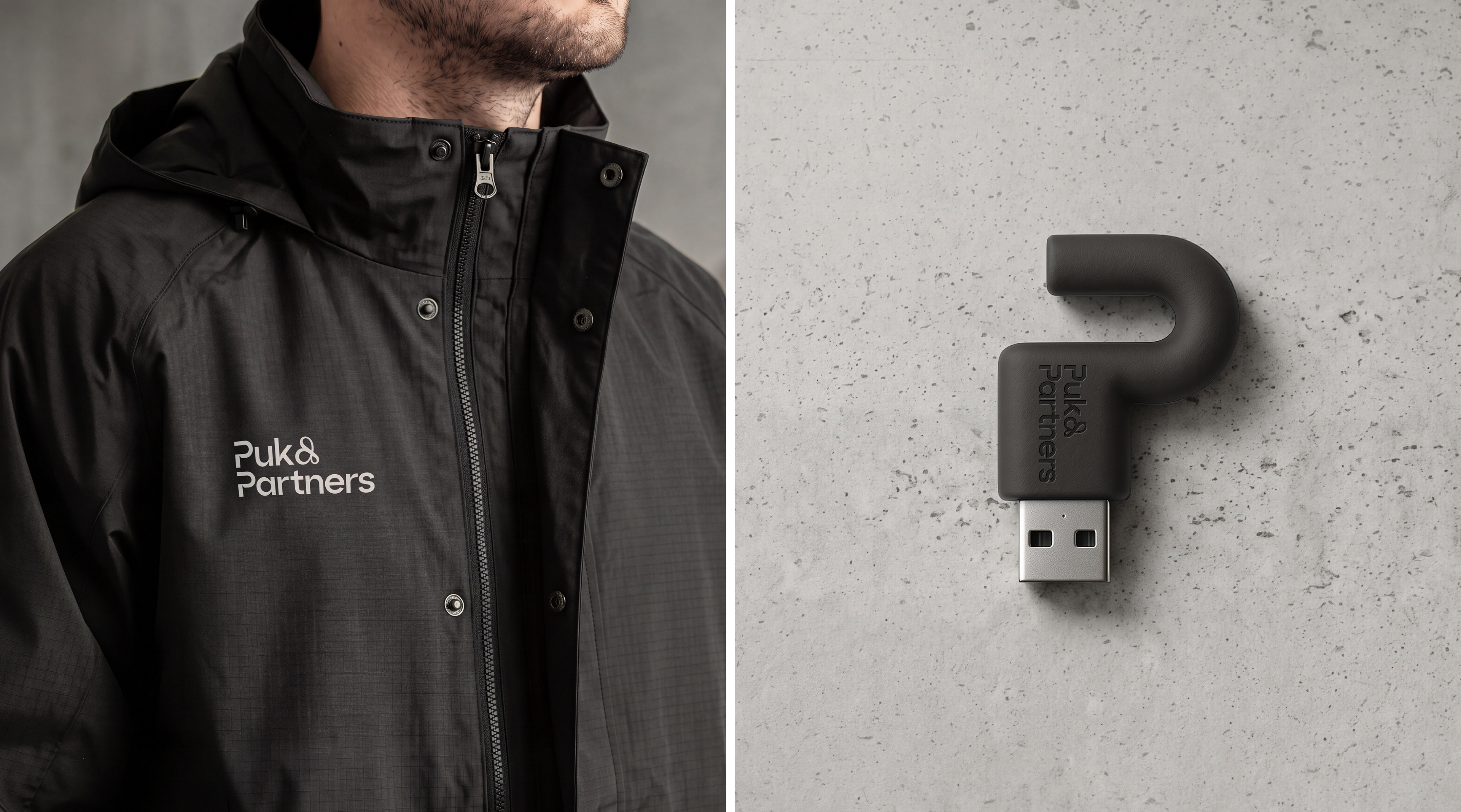
Drawing from the meaning of “Puk,” which refers to a lock, we designed an emblem that reinterprets a lock opening through the letter 'P'. A closed form unfolds, much like an idea becoming a space. The lock, key and opening metaphor also expresses Puk’s turnkey approach: a project is carried from first idea to design, application and final detail, then delivered as a completed space. The logotype shares the emblem’s contrasting, anatomical structure, while the custom-designed ampersand (&) reinforces the Partners side of the brand.
The visual language, in turn, draws on architecture itself. A color palette referencing the natural tones of architectural materials plays a key role in the identity. The identity extends across an icon set, technical-drawing-style illustrations, 3D renders with construction-material textures and motion content, as well as workwear for site teams, including vests, helmets and jackets, along with stationery and photography direction.
The result reflects how Puk & Partners practices architecture: taking responsibility from the first decision to the final detail, treating every element as part of a cohesive whole, and carrying each project through to completion.