Before we start, here is a suggestion, you should visit the website of the logo designer, Pentagram (which I am a big fan of), and read the story of the logo themselves. It is paragraphs long and it gives a great breakdown.
Almost all of us know the Warner Bros logo by heart. When you know a logo this good (or anything else), most of us feels like we are losing something. This is understandable, but change is now inevitable for rooted companies like this.
We are at a point that we can’t avoid compatibility to the digital age. The reason most of the big companies simplify their designs is because they are at a point they to. Almost all of the rebranding you see (and I analyze) is caused by digitalization.
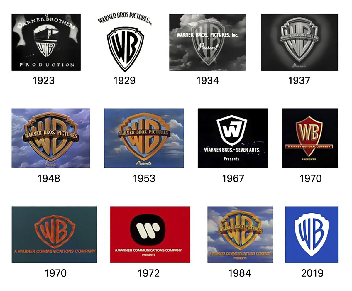
Let’s start with Warner Bros logo now. 2023 will be the 100th year of Warner Bros. In order to enter the new century with a renewed strategy and identity, they decided to work with @pentagram (that they worked before). We have seen a little of this logo in 2019.
I have to start a subparagraph for Pentagram.
Pentagram is the world’s biggest independent design office. They have legendary designers and amazing portfolios that would make you say ‘oh, they designed this too?’ If you haven’t heard about them yet, make sure you look into them.
Before starting to work on the Warner Bros logo and brand strategy, Pentagram made interviews with Warner Bros employers and high ranked share holders all over the world to get some information. Here is what they ended up with: story telling is in the DNA of this brand.
After this insight, the brand placement they’ve came up with for Warner bros is ‘’We believe in the power of story’’; we can say that new corporate identity is the result of this placement. We’ll understand it better when we get into details.
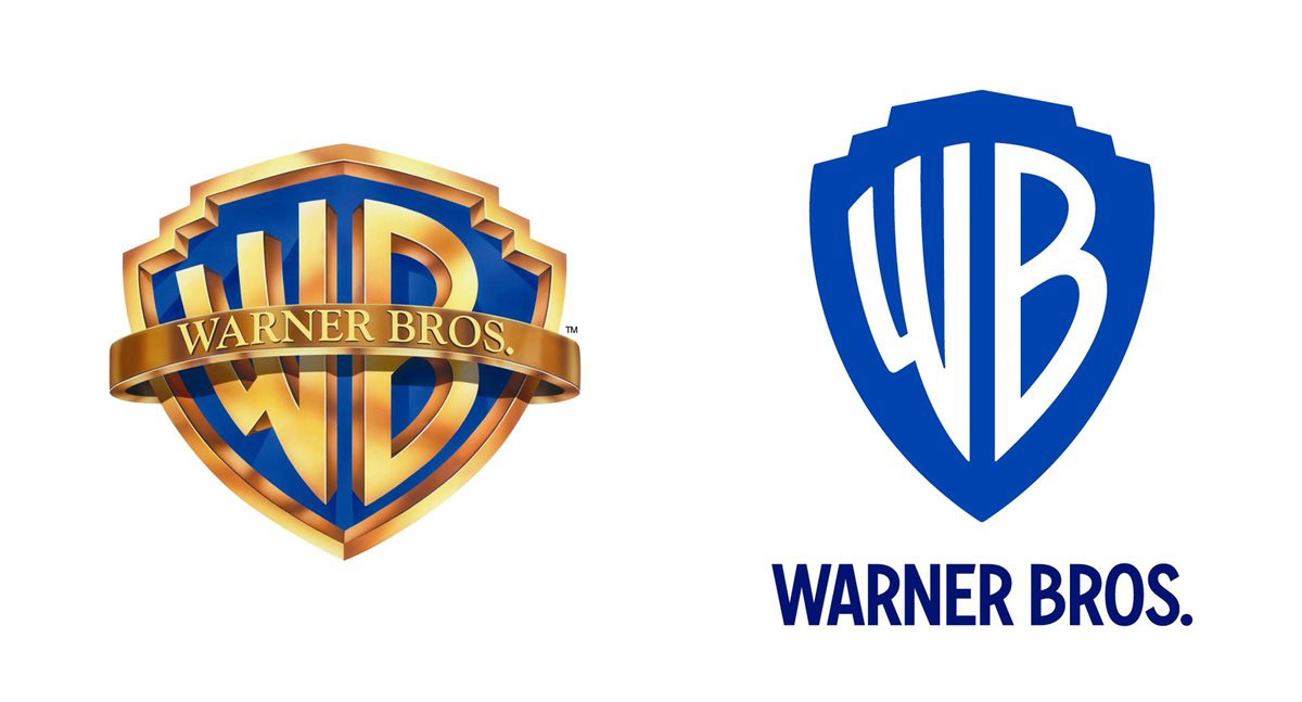
The biggest thing they removed from the old logo is its gold color and texture. The most important element they used is the shield shaped form. This shield form is in the center of all placements. It revised into the golden ratio, that chunky shape is elongated and became dynamic.
The blue tone in the old logo is livelier now. With this flat logo, they also crated another more dimensional version (which they kept the frame and the shadow as it was in the old version) to use only on the screen and special occasions.
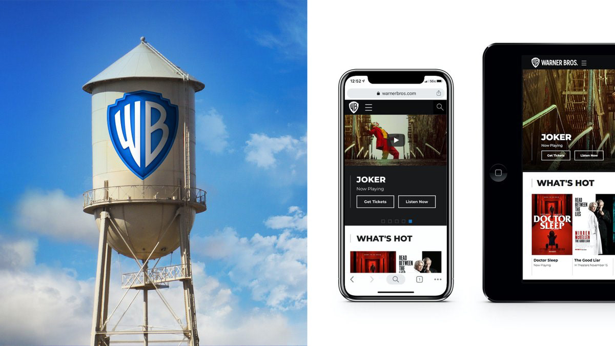
This simplified shield form is much more functional and effective that the busy look in the old logo. It has the same clear effect in very small scales and on that famous water tank at the Warner Bros studios.
This shield form (which is at the base of the studio’s movie plate) can be revised easily for different themes. If we consider Warner Bros themes that we see in the opening and closing sequences in the movies, this use opens up a big space.
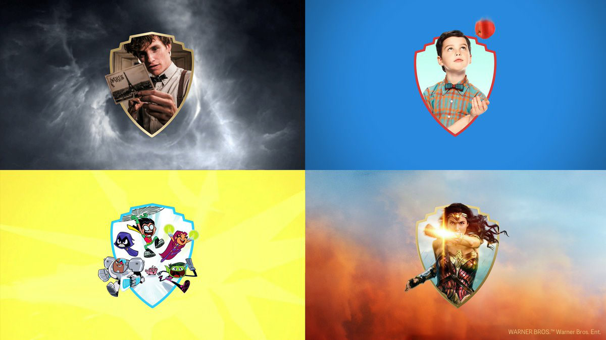
And it can be use as a window that symbolizes opening up to the new world.
Typography in the logo is revised to fit this shield form, but they kept it loyal to the anatomy of the letters. Based on W and B of the logo, they have designed a wide font group named ‘Warner Bros Sans’. The designer of the font is Jeremy Mickel.

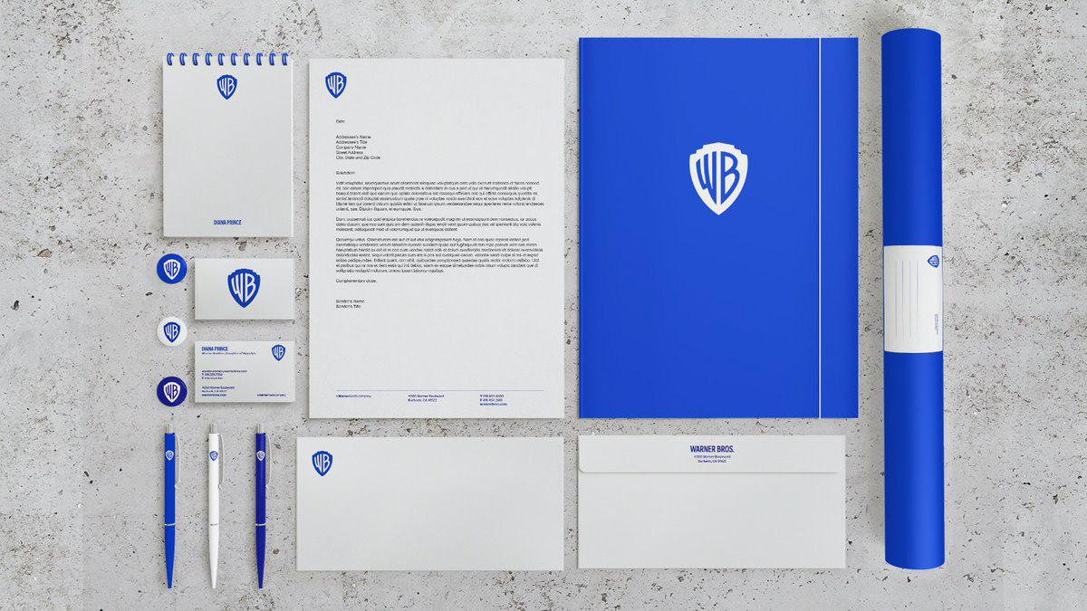
In the corporate identity, they preferred a minimal use that is seen in the whole rebranding. I loved the fact that they used Warner Bros characters with funny titles in the presentation of the business cards.
Shortly, as I dug into it in more details for this article, I fell fort this rebranding even more. Once I recovered from the shock, and considering that we’ll see it in almost all of the movies we’ll watch in the near future, I think we’ll embrace it quite soon.