Not a single day passes before a rooted company revises one of its old logos and emphasize ‘’legacy’’. Now it’s Renault’s turn.
Before starting this flood, you may want to read what I wrote about Peugeot rebranding, because I explained why logos become two dimensional and specifically why there is a numerous logo changes in automotive industry, I better not repeat myself. Assuming you’ve read those, I move onto Renault.
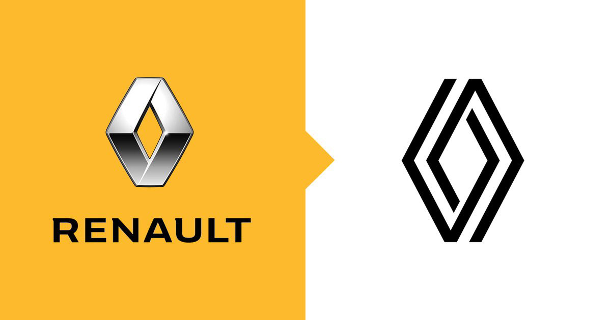
This is the 9th big logo change in Renault’s history (They counted as one after 92). We can’t say it’s a radical change because Renault opted to focus on the 1972 logo emblem that Victor Vasarely designed and revise it.
Let’s take a break and let’s talk about this revising the old logo, in other words this ‘’legacy’’ issue. It’s not a coincidence that we run into this quite often. As you know, there are few brands that can emphasize their history.
Therefore, ‘’we draw strength from our past and look into the future through that force’’ kind of strategy starts the match with 1-0 lead. Because it gives some trust to the consumer immediately and you start up ahead of your ‘new’ rivals. It has some disadvantages too, like the necessity to deal with the perception of getting old.
But if your history is actually rooted in the eyes of the consumer and your vision survives, ‘Carrying a past element to the present by modernizing it’ always works. Renault has chosen this path like almost all old companies. And Renault has another advantage in branding:
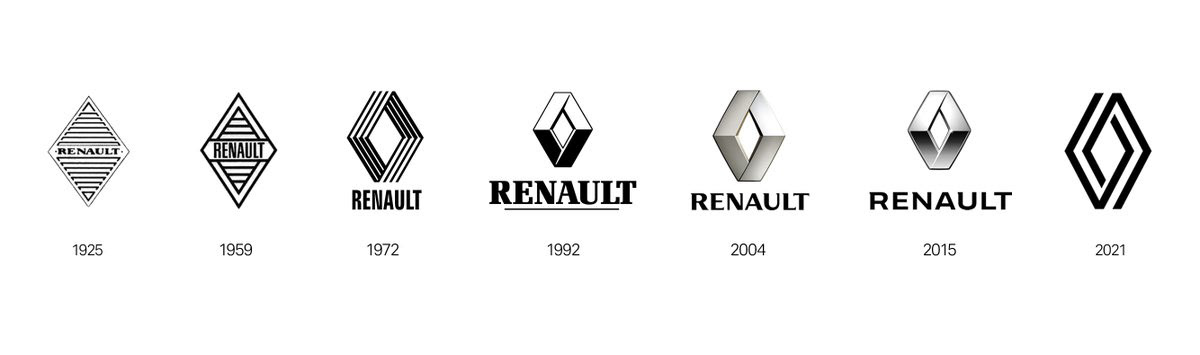
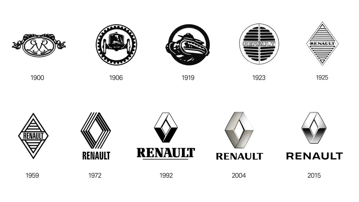
Rhombus is used in their logo one way or another since 1925, in other words, the diamond form. Continuity for branding is as valuable as a diamond. (If you notice, I’m trying to spice up the flood by lame advertiser sentences)
You can listen design director of Renault, Gilles Vidal on the diamond shape here:
To sum up briefly, he says ‘’we took over this strong diamond form legacy, modernized it and made it compatible with the digital world’’.
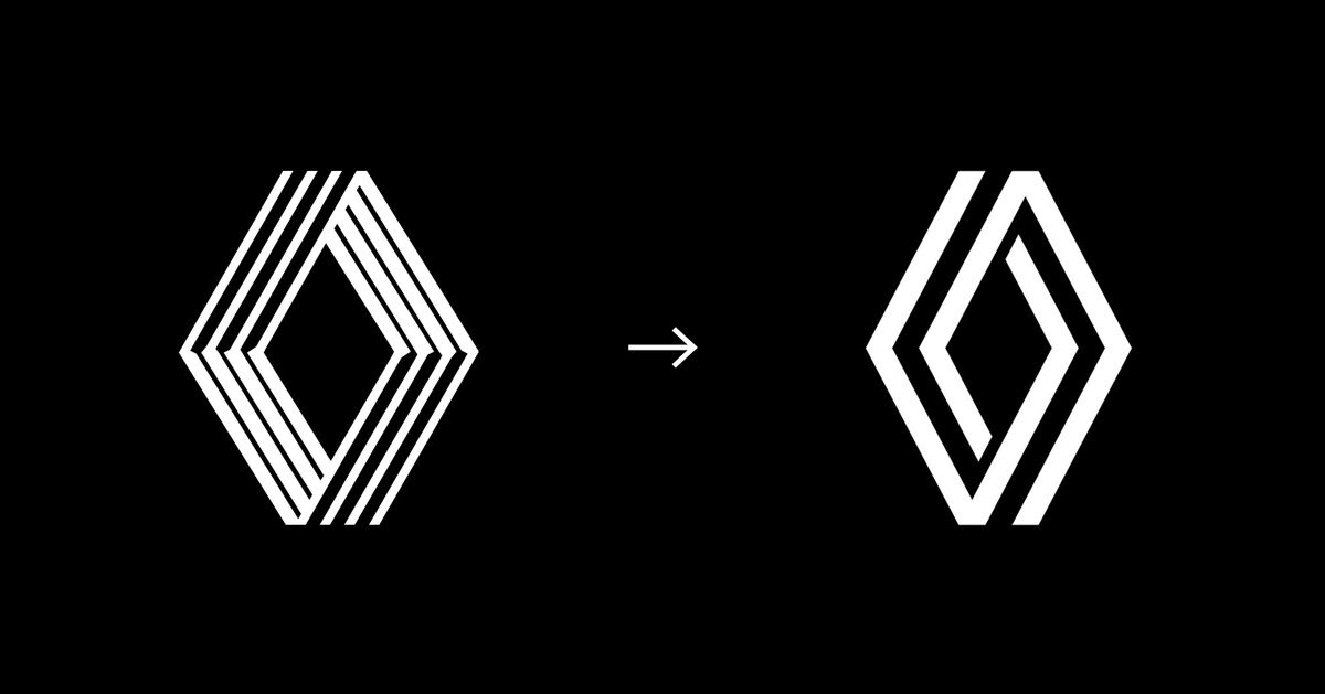
Gilles Vidal naturally talks about the diamond form, but let us specifically compares 1972 logo and the new logo. There are 2 big decisions here. First, they modernized it based on the 1972 emblem, not the emblem that was used since 1992.
So this new logo is a revised version of 72’ emblem. Probably when they simplified the last one, they had a very similar result with the one in 92. It is interesting when an emblem is simplified and turns into the version in the past. Eventually, they moved forward with 1872.
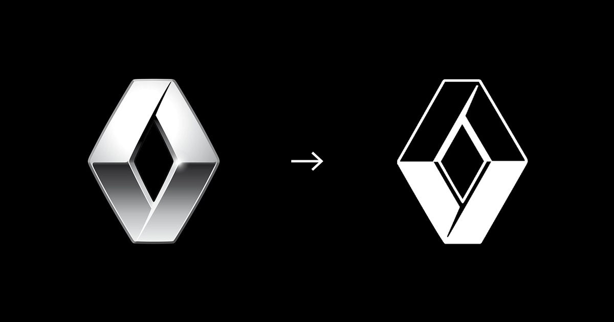
Let’s move to the second big decision about the logo. The name ‘Renault’ is removed from the logo. I think the real courage is here. They said when it’s necessary they’ll use logo with Renault, but it is still a big decision. And they owe it to the ‘diamond’ for the most part.
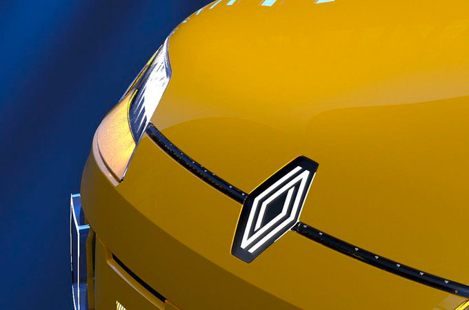
Renault and the diamond form is so integrated in our mind, even if you can’t see the name, even if the emblem you see is not exactly the same emblem you remember, your brain matches this diamond shape with Renault. This is a blessing every brand would like to get.
This can only be achieved through continuity. Logos are not sacred, they can be changed, but on these changes, you shouldn’t forget that continuity is one of the most important elements in branding.
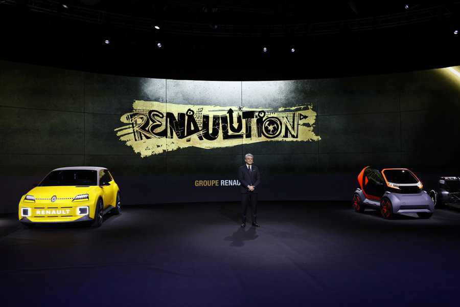
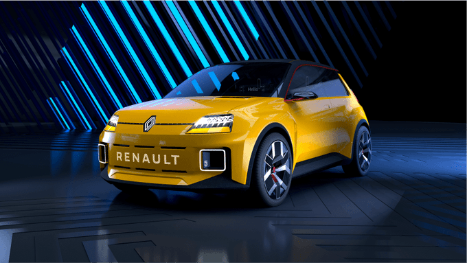
As a part of the strategic renewal movement called ‘Renaulution’, we’ll see this new logo first on the new model electric Renaults in 2022 and in all Renault vehicles in 2024.
In conclusion, despite all of its advantages, I think logo takes the easy way. It feels like this logo needs to be supported with modern colors and revolutionary car models. If not, it is possible that it’ll look out of date. Or these flat worlds are too much for me, I don’t know.